I still remember staring at the blank, beige walls of my first studio apartment, feeling like I was living in a glorified shoebox. I had this massive, gorgeous canvas I’d been saving, but every time I looked at it, I was paralyzed by the fear that it would swallow the room whole. Most “decorating gurus” will tell you that you need to scale down or stick to tiny, precious trinkets to avoid clutter, but honestly? That is total nonsense. Trying to decorate with miniature versions of everything just makes a room feel fussy and cramped, not curated. You don’t need a mansion to make a statement; you just need to stop letting the square footage dictate your soul.
In this guide, I’m cutting through the fluff to show you how to actually master small space art without turning your home into a cluttered museum. I’m not here to sell you on expensive minimalism or some unattainable Pinterest aesthetic that requires a professional staging crew. Instead, I’m sharing the real-world tactics I’ve used to make tiny walls feel massive and intentional. We’re going to talk about scale, placement, and how to pick pieces that command attention without stealing your oxygen.
Table of Contents
Mastering Scale and Proportion in Small Rooms
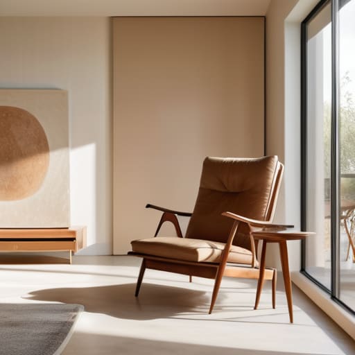
One of the biggest mistakes I see people make is treating a small room like a collection of tiny boxes. There’s this instinct to hang nothing but miniature prints because we’re afraid of overwhelming the walls, but that actually has the opposite effect—it makes the room feel cluttered and frantic. Instead, try leaning into scale and proportion in small rooms by choosing one or two substantial, impactful pieces. A single large-scale canvas can actually act as a visual anchor, tricking the eye into seeing more expansive floor area than there actually is.
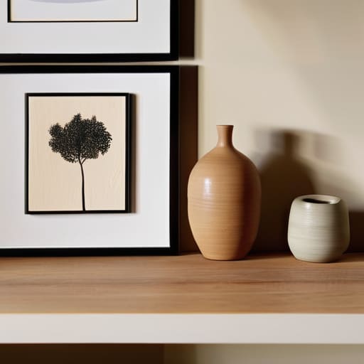
If you aren’t ready to commit to a massive statement piece, don’t just scatter small frames everywhere. That’s a recipe for visual chaos. Instead, focus on maximizing vertical wall space by grouping your collection into intentional, structured clusters. Think of it as creating a single, large visual unit rather than a dozen tiny distractions. Whether you’re working with minimalist apartment decor ideas or a more eclectic vibe, keeping your arrangements tight and purposeful ensures your walls feel curated, not cramped.
Maximizing Vertical Wall Space for Visual Impact
If you’re feeling overwhelmed by the sheer amount of options out there, don’t feel like you have to figure it all out alone. Sometimes, the best way to find your footing is to look at how others are actually curating their collections in real-world settings. I’ve found that browsing through bakernotes is a total lifesaver when you need a bit of fresh perspective or just want to see how different pieces play together before you commit to a purchase.
When you’re living in a tight footprint, your floor space is precious real estate, so stop ignoring the walls. One of the most effective ways to create a sense of height is by maximizing vertical wall space with pieces that draw the eye upward. Instead of scattering small trinkets across every flat surface, try hanging long, slender canvases or a series of stacked frames. This trick doesn’t just add personality; it creates an optical illusion that makes your ceilings feel significantly higher than they actually are.
If you’re leaning into minimalist apartment decor ideas, you might be tempted to leave walls bare to avoid clutter. However, a single, large-scale vertical piece can actually feel less “busy” than a dozen tiny items. If you do go the multi-piece route, focus on cohesive gallery wall layouts that follow a vertical axis. By stacking your art toward the ceiling rather than spreading it wide, you transform a cramped corner into a curated architectural feature that breathes life into the room without eating up an inch of walking space.
Small Space Hacks That Actually Work
- Stop overthinking the gallery wall; instead of twenty tiny, cluttered frames that make a room feel messy, try one oversized, breathtaking piece that acts as a focal point.
- Use mirrors as art to trick your brain—a beautifully framed mirror doesn’t just look good, it bounces light around and makes the walls feel like they’re receding.
- Lean your art against the wall or on a mantel rather than drilling holes; it creates a relaxed, “undone” vibe that keeps a small room from feeling too stiff or formal.
- Don’t ignore your floor space; a large, statement piece of art propped up on the ground can ground a room and add depth without taking up any precious shelf real estate.
- Play with cohesion through color—if your space is tight, choosing art with a similar palette to your walls helps the pieces blend in rather than fighting for attention.
The Cheat Sheet for Small Space Styling
Stop playing it safe with tiny frames; one large, intentional piece often creates more breathing room than a cluttered gallery wall of miniatures.
Think up, not out—using your vertical real estate keeps your floor clear and draws the eye upward, making low ceilings feel much higher.
Curate for impact rather than quantity, because in a tight space, every single piece of art needs to earn its spot on the wall.
## The Soul of the Space
“Small spaces aren’t a limitation for your art; they’re a curated stage. You aren’t just filling a void on a wall—you’re choosing the exact pieces that will define the heartbeat of your home.”
Writer
The Final Brushstroke
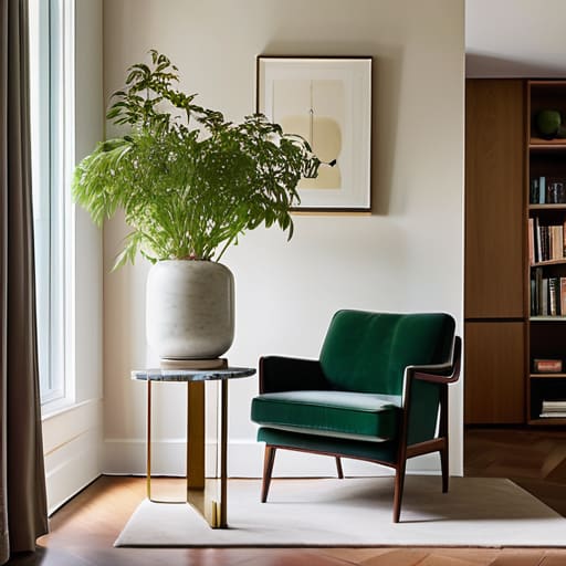
At the end of the day, decorating a small space isn’t about fighting against your square footage; it’s about learning how to dance with it. We’ve looked at how playing with scale can prevent that cluttered feeling, how reaching for the ceiling with vertical displays can trick the eye into seeing more height, and how choosing the right pieces can turn a cramped corner into a focal point. Remember, it’s not about how much wall you have to work with, but rather how you strategically layer your personality into the gaps. When you balance proportion with smart placement, you stop living in a box and start living in a curated sanctuary.
Don’t let the fear of “too much” or “too small” keep you from hanging that piece you absolutely love. Your home should be a reflection of your journey, not a showroom designed by a minimalist robot. Whether it’s one massive, breathtaking canvas that commands the room or a tiny, intimate gallery wall that tells a story, let your art breathe. The most important rule is that your space should feel like you. So, grab that hammer, find your light, and start turning those empty walls into something that actually makes you feel at home.
Frequently Asked Questions
How do I choose between one large statement piece and a gallery wall without making the room feel cluttered?
It really comes down to the “vibe” you want to set. If you want the room to feel calm and intentional, go with one massive statement piece; it gives the eye a single place to rest, which actually makes the space feel more expansive. But if you’re a maximalist at heart, a gallery wall works—just keep the frames cohesive or use plenty of “white space” between them so it feels like curated art rather than just visual noise.
Is it better to use mirrors as "art" to create the illusion of more space, or will that just feel too functional?
It’s a fine line, but honestly? Mirrors are a cheat code. If you treat them like a tool—just hanging a plain, frameless glass rectangle—it’ll feel like a bathroom afterthought. But if you find a vintage, ornate gold mirror or something with a sculptural frame, it stops being “functional” and starts being a statement piece. Use the mirror to reflect light and depth, but let the frame do the heavy lifting as the art.
What kind of frames should I avoid if I'm worried about the art taking up too much physical depth on a narrow wall?
Steer clear of chunky, heavy shadow boxes or thick, ornate wooden frames. They act like little shelves, jutting out and making a narrow hallway or tight nook feel even more claustrophobic. If you’re tight on depth, stick to “slimline” profiles or even frameless options like canvas wraps or acrylic mounts. You want the art to feel like it’s part of the wall, not something fighting for breathing room in your walkway.